Late last year I had some thoughts rolling around in my head, they had plenty of room. (not a big head, just empty space). I was debating on what the new year would bring to card collecting and this blog. Many of you have had posts about your personal goals for 2012. I wanted to do something similar but just never got to it.
As far as my collecting habits and direction, I don't foresee any major changes. I'm still pursuing every Indian card I can find !
This post will represent what I hope to be a minor shift in the direction of this blog. When I first started "All Tribe Baseball" I planned on it being just that. Cards, facts and misc. info concerning the Cleveland Indians. Well, I soon found out that there are many other aspects to card collecting that I wanted to present and discuss, so I have had a variety of topics from time to time. That part probably won't be changing. However, I have always been one to read as many blogs as I can, make a few comments here and there and derive my own opinions from some of the various subjects that are discussed. Other than comments, I generally kept my thoughts to myself.
After a little over three years, I want to come out of my shell at least a little bit, and get more involved. I don't plan to be be too, overly critical of anyone, any blogs or any products. Just voice my views more than in the past and try to come up with more interesting and informative posts.
Most of any product reviews I do will be of the retail variety. There are no card shops near me to buy even packs of hobby version products.
That being said, here's what I think of 2012 Topps !!
 Upon entering the card aisle of any of the major box stores stores you may see one or the other of these boxes. The one on the left is the Target version with Walmart on the right. Only subtle differences on this side. Target has a price marked on their boxes with the official logo moved down so Roy will have something to focus on. I didn't check out Meijers' blasters but they are probably similar to Target.
 This side tells you which one came from Walmart. The design has been altered to make room for the "Exclusive Blue-Bordered Parallel Cards" seal. More on the blue-border cards later.
Now you get to see the beginning of my wrapper collection for 2012. Fanfare please !!
 This is the basic 8 card foil wrapper found in most retail blasters.
 If the blaster contains an exclusive patch card, it will be in this foil wrapper.
 Or you can choose a 36 card jumbo, or rack pack. These are more of a vinyl material rather than foil. This one came from Walmart. I haven't seen them at the other stores yet so I don't if there are any differences in design. In years past, sometimes there has been.
 The regular 12 card packs from Target are always the white vinyl type and indicate at the top that they may contain exclusive red-bordered cards. Target's answer to Walmart's blue borders.
 Walmart and Meijers both use the foil, 12 card wrappers for their retail packs.
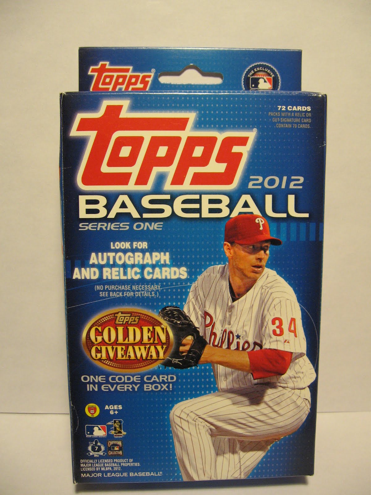 Last, for now, but not least you can opt for the 72 card hanger box. This is Meijers version. Once again, I haven't seen them anywhere else yet to compare design differences.
Well, that's what available in our area. Now let's look inside !
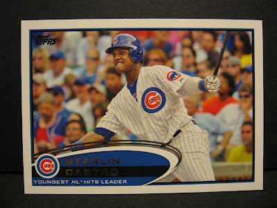
 Good old card #7 !
I'm not totally sold on this design yet. The whole oval, swirly thing overpowers the bottom of the card. Especially when the RC logo appears above the team logo. And the foil names. Depending on the background color, some of the names are hard to read unless the lighting is just right. Personally, I like to see the player's position on the front of the card also.
 I like the horizontal cards better. The longer bottom edge seems to accept the shape of the logo much better. And look at that white print. You can actually read it !! If the player's names were in that white print I'd be a happy camper.
 Now, the blue-bordered parallel. I'm sure someone else has purchased a Walmart blaster. This may have come out in someone else's review, but are there "hot " boxes or do they all have two completely blue packs inside ? I got thirteen blue borders in this box, all in two packs with three inserts.
 The gold cards remind me of last years "liquorfractors". They are dark and rather hard on my eyes. But at my age, every thing's hard on my eyes. So that might just be me !
 Gold Futures
 I like the horizontal cards better. The longer bottom edge seems to accept the shape of the logo much better. And look at that white print. You can actually read it !! If the player's names were in that white print I'd be a happy camper.
Why do they have to mix vertical and horizontal formats in the same set ? I hate that ! I know almost all sets are that way these days, but they look so much better in storage if they all go the same direction. Whether you store them in boxes or albums you have to turn the card or the album to see, read and enjoy them. Just another one of my pet peeves.
I told you I was going to get brutally honest this year !!
 Now, the blue-bordered parallel. I'm sure someone else has purchased a Walmart blaster. This may have come out in someone else's review, but are there "hot " boxes or do they all have two completely blue packs inside ? I got thirteen blue borders in this box, all in two packs with three inserts.
 The gold cards remind me of last years "liquorfractors". They are dark and rather hard on my eyes. But at my age, every thing's hard on my eyes. So that might just be me !
 Gold Futures
 This set I don't mind. I like the black border with the gold trim. And the bright color inside.
 Golden Greats
 Golden Greats
 I also like these, but why didn't they use the shiny gold emblem as on the Gold Standard insert ? Then I would really like them !
 Golden Moments
 Golden Moments
 Nice idea for an autograph card. Otherwise, too much blank space for me.
 Gold Standard
 1987 Mini
 Timeless Talents
 Gold Standard
 There again, I like the gold seal. If the inscription under the seal ( 6oo Home Runs) was just a little darker so it would show up better, it would be my favorite insert.
 1987 Mini
 I like these !! Probably everyone does. Maybe it just makes us dream of the "good 'ole days" .
 Timeless Talents
 I don't know if I like comparison cards or not. It has to great for the young guy to think he's being compared to a great HOF 'er. But they have a long way to go. It will be interesting to look at this set in, say 2027, and see how they compare then. Not to take anything away from these young guys, they are terrific players. But a lot can happen in this game.
 Historical Stitches Manupatch
 Historical Stitches Manupatch
 Both of my boxes had stitches patches, the other being Reggie Jackson. I think I might like the Retired Numbers better.
Well, that's the way I see it !
I purposely have not read all of the other reviews. But now that I have thrown my unbiased thoughts out into the blogosphere, I will go back and read them to see how I compare.
Great post, really liked the breakdown!
ReplyDeleteAny chance that Ryan is up for trade? :-D
Nice review! I'm getting a little tired of all the parallels, but the gold futures cards look like they might be nice. The Mantle card is cool as always. That's one of the cards I'm looking for this year. The patch cards look like they might be pretty nice too.
ReplyDeleteI think that was a nice review and hey, it's your blog, you be as brutal as you feel is necessary. I might have a gold Indian for that Hamilton if it's for trade.
ReplyDelete